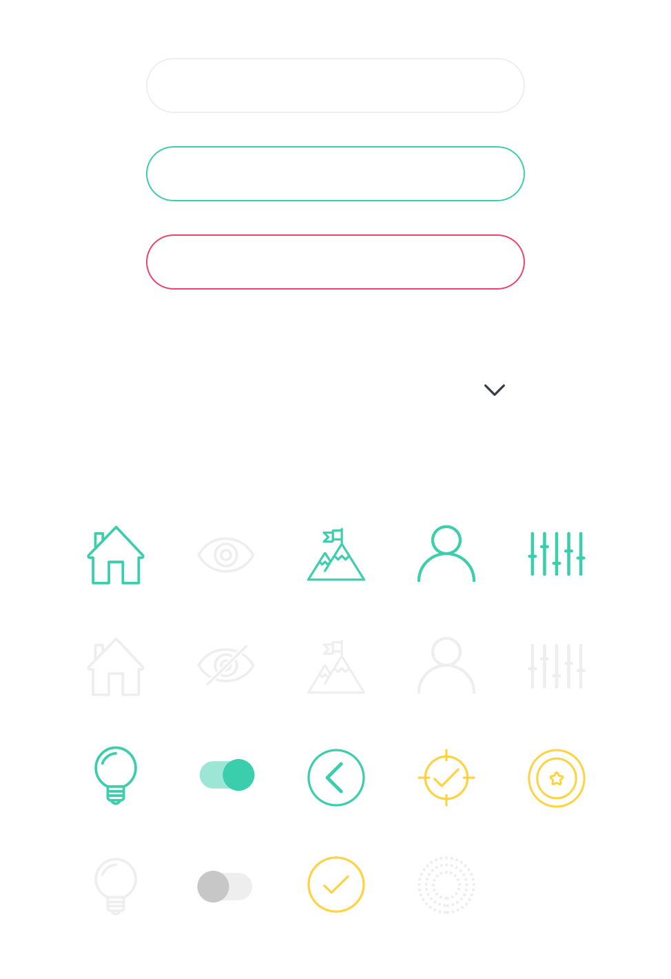
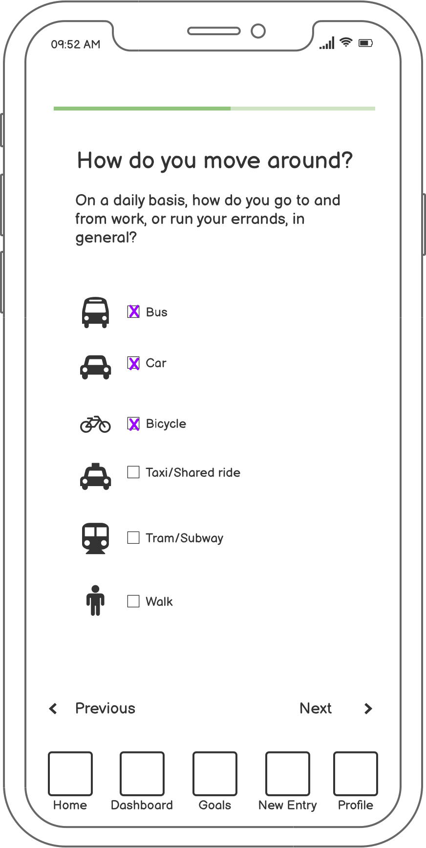
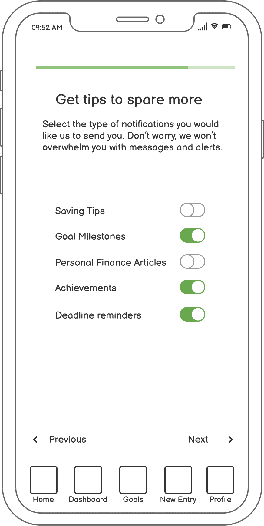
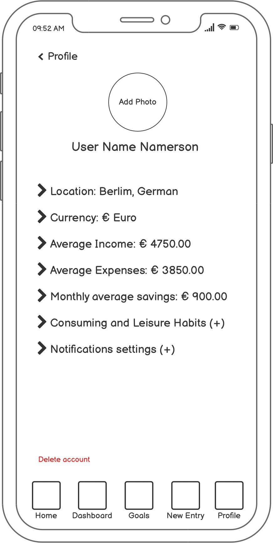
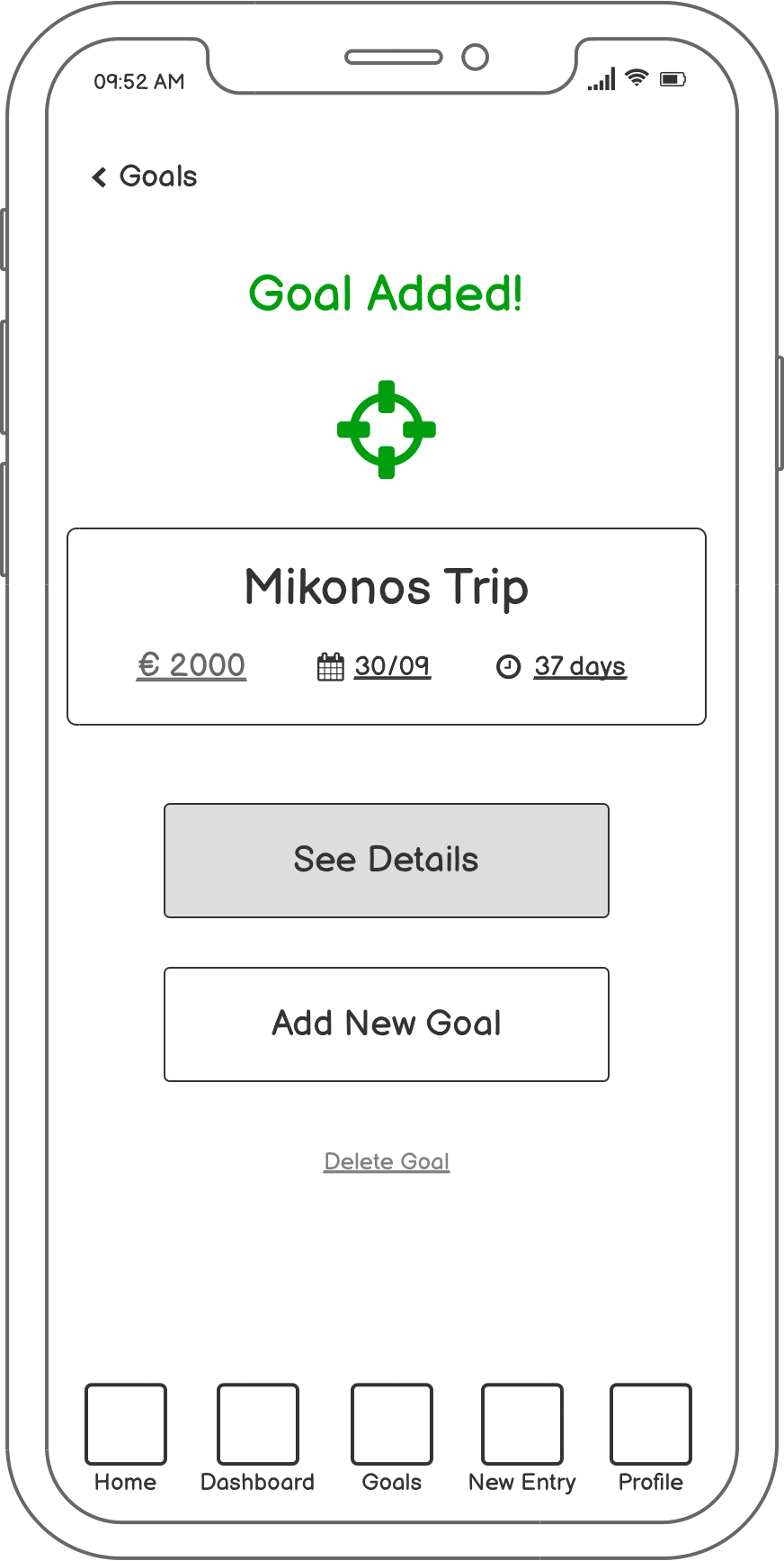
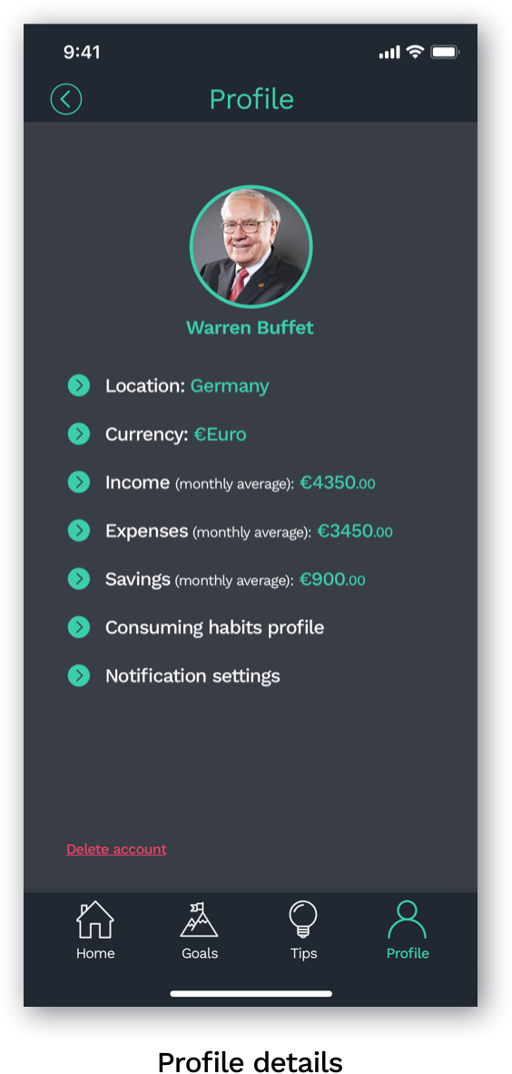
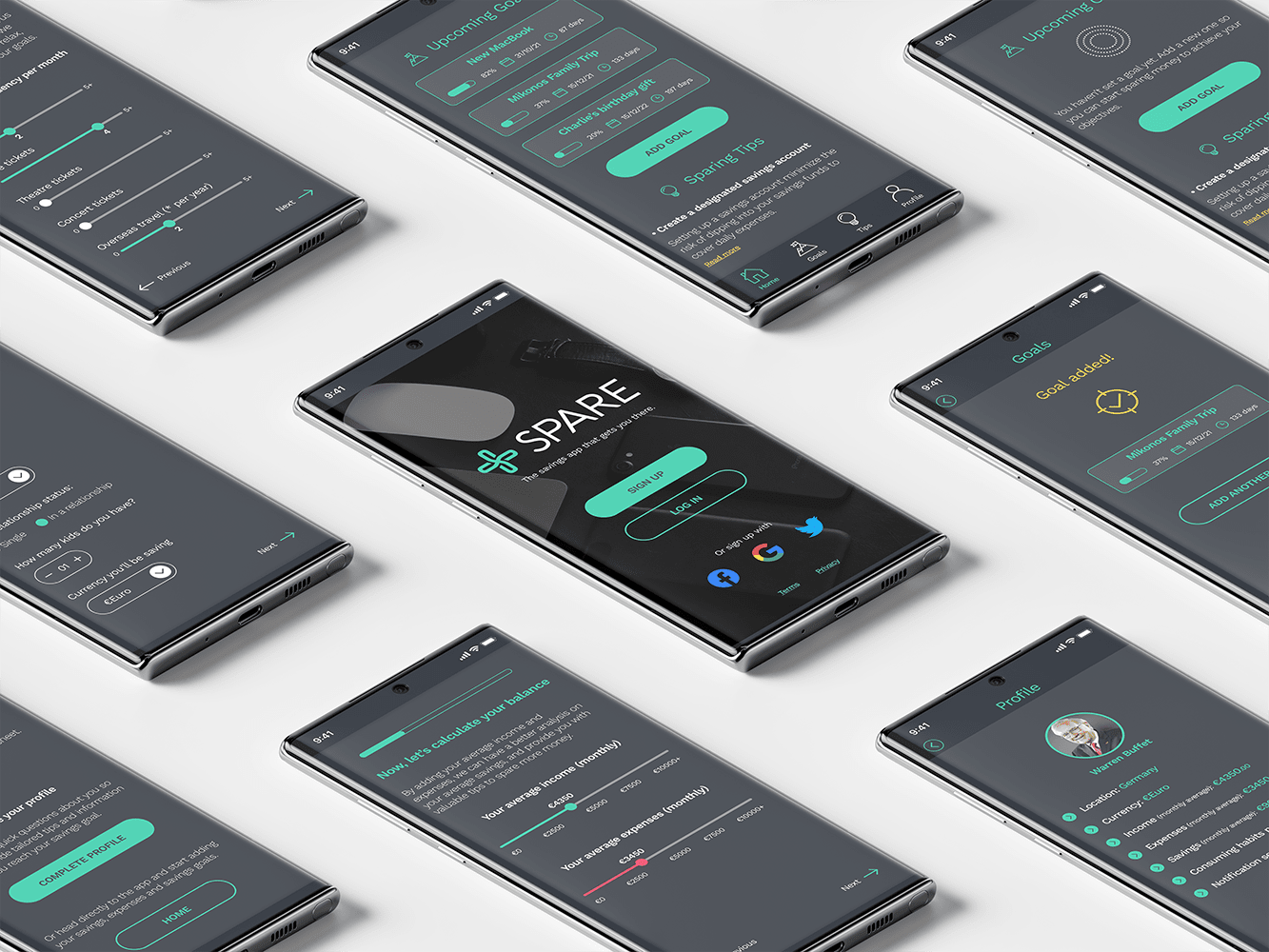
The color strategy employs intentional psychological associations to support the app’s financial purpose:
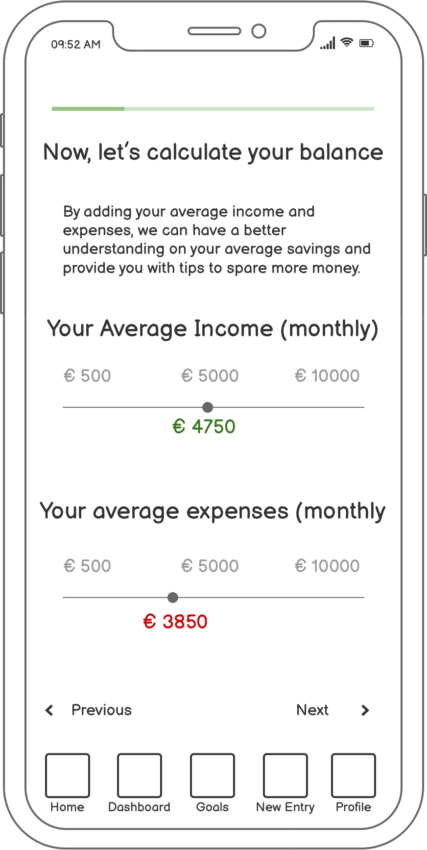
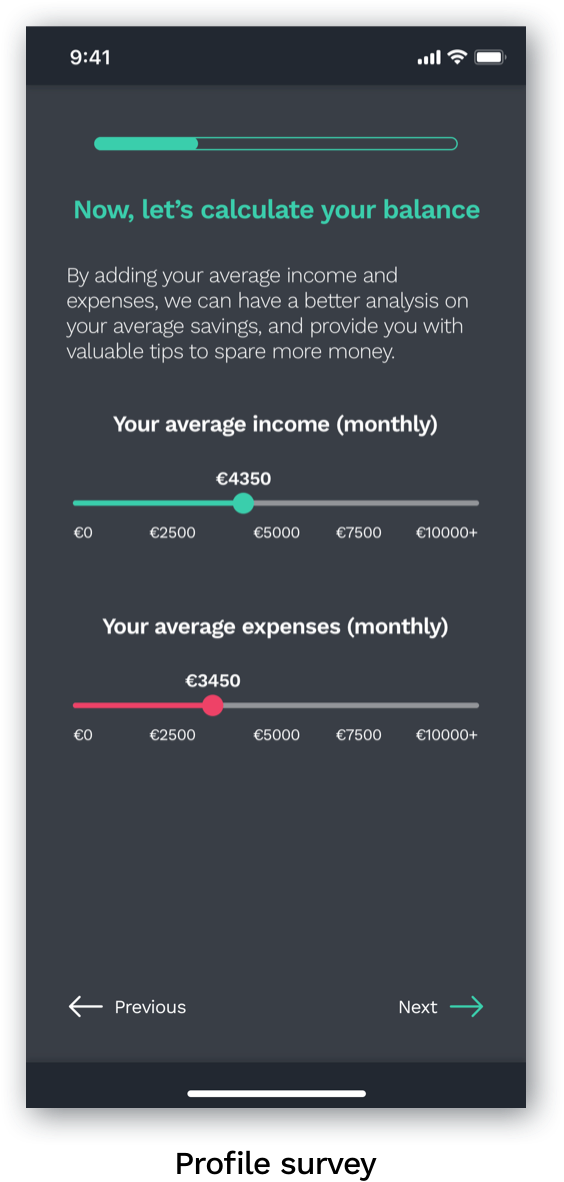
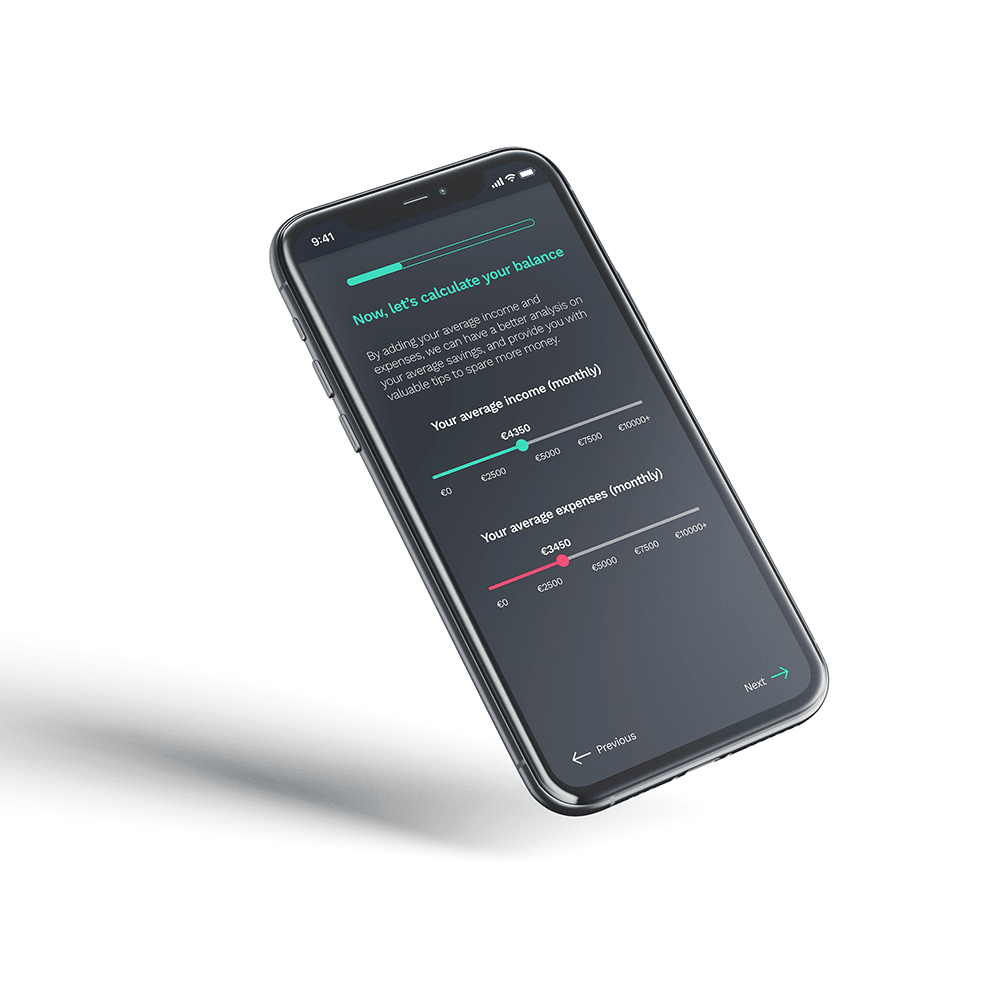
Vibrant green serves as the primary brand color, representing income and growth with a modern energy that maintains user motivation.
A softened red indicates expenses without discouragement – acknowledging financial setbacks while encouraging continued progress toward goals.
Golden yellow highlights achievements and milestones, creating moments of celebration throughout the user’s financial journey.
Muted blue delivers stability and trustworthiness for informational elements and interactive components.
Dark gray and light gray complete the system, providing content hierarchy and ensuring optimal readability across all screens.


