
A concept UX/UI case study on bringing platform-specific design to the growing pet care market.
The pet care market is booming – projected to reach USD 325 billion by 2028.
While subscription boxes have gained popularity, most offerings remain web-based with clunky mobile experiences. The opportunity was clear: create a native mobile application that makes pet product discovery and subscription management delightful.
The business opportunity was threefold:
PET SHOP BOX is a monthly subscription service delivering curated boxes of premium pet products. Each box contains carefully selected treats, toys, preventative medications, grooming tools, and accessories tailored to the pet’s profile.
According to Globe Newswire, the global pet care market is projected to reach USD 325 billion by 2028. A significant trend is the rapid growth of online pet product sales, which saw a 51% increase in March 2020 alone.
While several box subscription services exist, most are primarily web-based, creating an opportunity for a dedicated native mobile application.
Initially focusing on dog owners (with plans to expand to other pets), the service targets pet parents who:
1. Regularly purchase premium toys and treats
2. Value convenience and curation
3. Are willing to invest in a subscription to enhance their pet’s experience

The brand identity was designed to give Pet Shop Box a distinctive personality while working within platform guidelines.
The approach establishes a fun, lighthearted, and friendly tone reflected in playful copy with pet-related wordplay (a nod to the name’s reference to the 80’s pop group Pet Shop Boys). From the start everything was pawssible (see what I did there?)
Muted, earthy tones were selected to create a clean UI that complements product photography without competing for visual attention.

Each platform version adheres to its default font family:

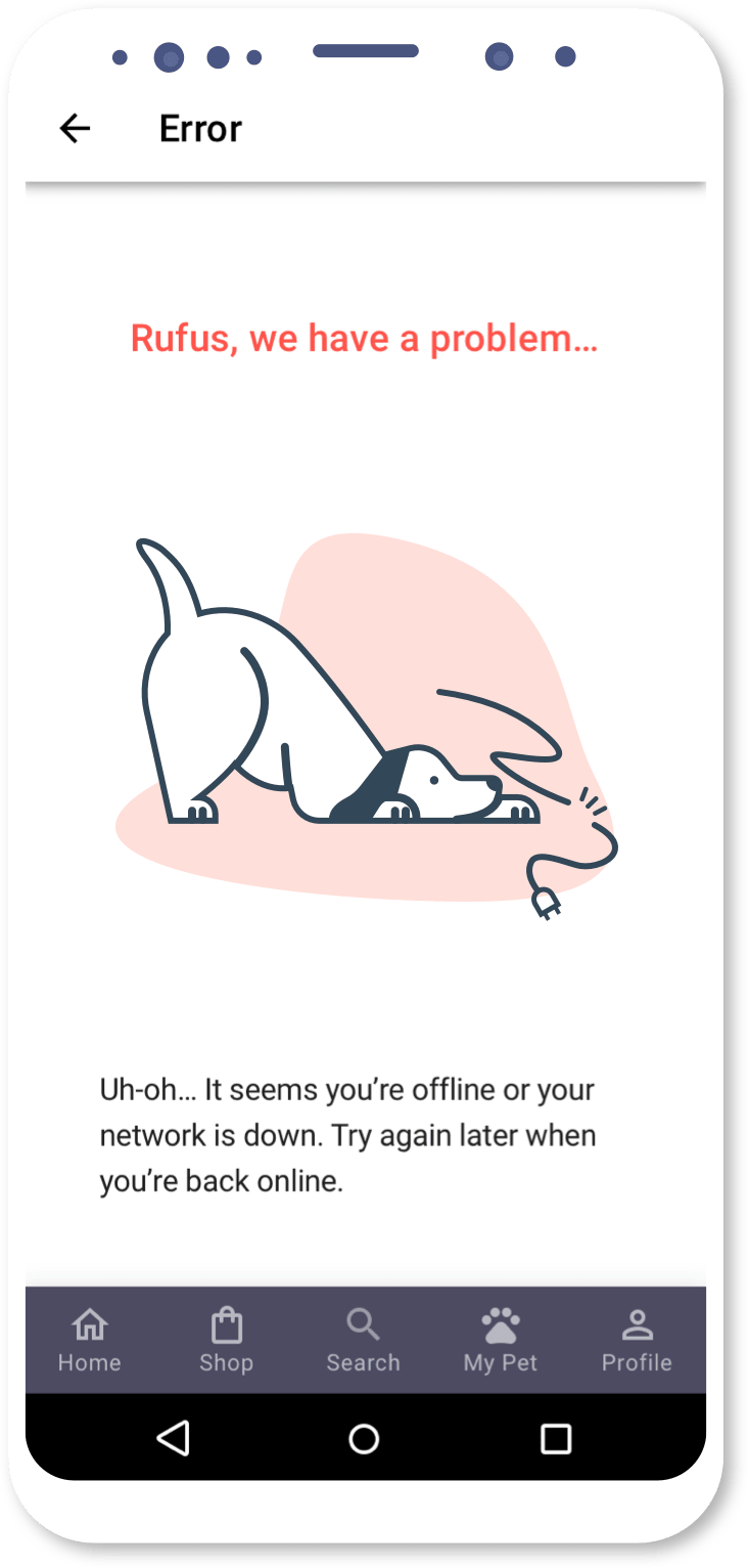
Outlined icons and simple 2D illustrations were chosen to:
* Illustrations by Alaina Johnson: https://dribbble.com/alaina
Final development included:
Although not an initial requirement for this project, I was able to include a simple animation to show my idea for a custom loading screen.

The comprehensive design system included 27 screens for each platform, covering the complete user journey from onboarding to subscription management. The clear documentation provided:
The MVP design established a solid foundation while identifying clear opportunities for future releases:
Health & vaccination reminders to increase app stickiness
Community features to showcase pets enjoying subscription products
Location-based services connecting subscribers to nearby pet amenities
Each potential feature was evaluated against both user value and technical feasibility, creating a roadmap for ongoing development that balanced immediate needs with long-term vision.
The most significant insight from this project wasn’t that platform guidelines should be followed—that’s expected. The revelation was how much personality could still be infused within those constraints.
By focusing on the elements where brand voice could shine—imagery, copy, color palette, and animations—I created an experience that felt both familiar and fresh. Users navigate comfortably through platform-consistent patterns while connecting emotionally with the playful, pet-focused brand.
The best part?
This solution required no reinvention of established UX patterns—just thoughtful application of platform guidelines alongside strategic brand development.
Interested in collaboration, or just want to chat about design?
Then reach out and let’s talk.