1. About

I love it when I have the opportunity of thinking about a project from the very beginning, and that’s what happened with this one. As part of my UI Immersion program at Career Foundry, I had to develop a money savings app, starting by defining a comprehensive Brand Style Guide, including a logo, typography, brand colors, thinking about the values and mission of the brand, the overall communication tone, and defining which imagery would best represent the brand’s message.

This was a great opportunity to bring together old and new skills: branding and graphic design, combined with UI design.

Deliverables

Branding • Brand Style Guide • User Stories • User Flows • Mid & High Fidelity Wireframes • Prototyping  • Animation • Mockups

2. Manifesto

Dream. Spare. Achieve. Repeat.

We know that achieving greater goals requires extra effort. That is why they are worth it and why we give a higher value to them. No matter what your dream is – your wedding, a trip with the whole family, a new house, or a new car – our mission is to make sure you will reach it. More than help you get what you want, we will be together with you along the way, providing the tools and knowledge to make you take control of your finances, save more, and accomplish the goals you set for yourself.
We are SPARE.
The savings app that helps you get there.

3. Brand Style Guide

Our Values

• Supportive and motivational
• Helpful and educational
• Friendly and respectful
• Uncomplicated
• Trustworthy

Our Vision

Money does not control you.
You control your money.

Our Mission

To help you save money by better organizing and understanding your finances, setting goals, and having a more conscious way of saving and spending.

Our Logo

Logo Animation

Our Colors

Being a money-saving app, there are two natural color shades that come naturally: Green, representing income, and Red, representing expenses.

SPARE brand color uses a brighter shade of green, which is more modern and vibrant, perfect to keep the user motivated.

Since we know that setbacks happen, the red color has taken a pinkish tone, which is less severe and more friendly. It will still convey an expense, or even a setback, but will not discourage the user from keeping on track to their goals and to keep using the app.

Complementing the color palette there will be a golden yellow and a muted blue color, representing goals, milestones, and achievements, as well as text elements and links.

#3BCEAC
rgb(59, 206, 172)
C71 M0 Y17 K19

#222831
rgb(34, 40, 49)
C5 M4 Y0 K81

#EE4266
rgb(238, 66, 102)
C0 M72 Y57 K7

#FFD23F
rgb(255, 210, 63)
C0 M18 Y75 K0

#457B9D
rgb(69, 123, 157)
C56 M22 Y0 K38

#EEEEEE
rgb(238, 238, 238)
C0 M0 Y0 K7

Our Typography

Our Photography

“Money is not the thing. It is the thing that get us to the thing.”

SPARE’s photography must not focus on money itself, but the goals people will achieve with their savings. Photo’s should be realistic, not doctored or with excessive filters, and always contain a human element. They can and should be aspirational and inspirational, but at the same time portray real, happy people.

4. Mobile App UI

User Stories & User Flow Diagram

#1

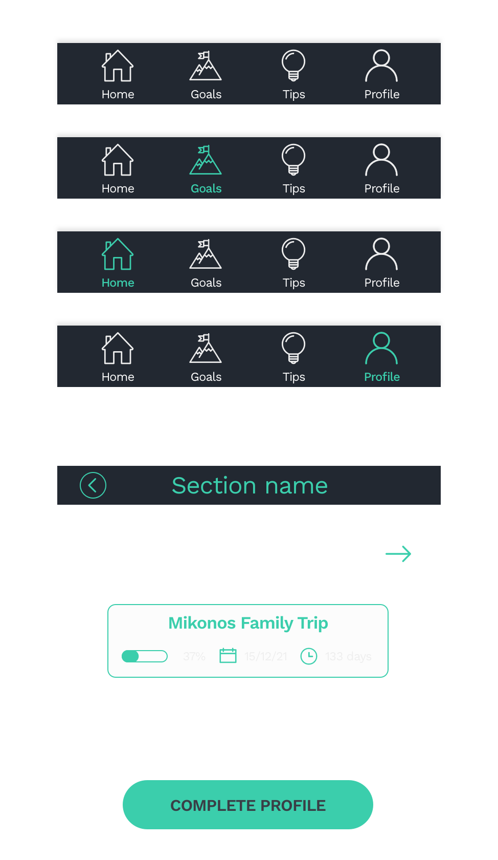
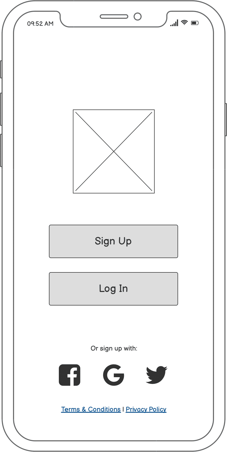
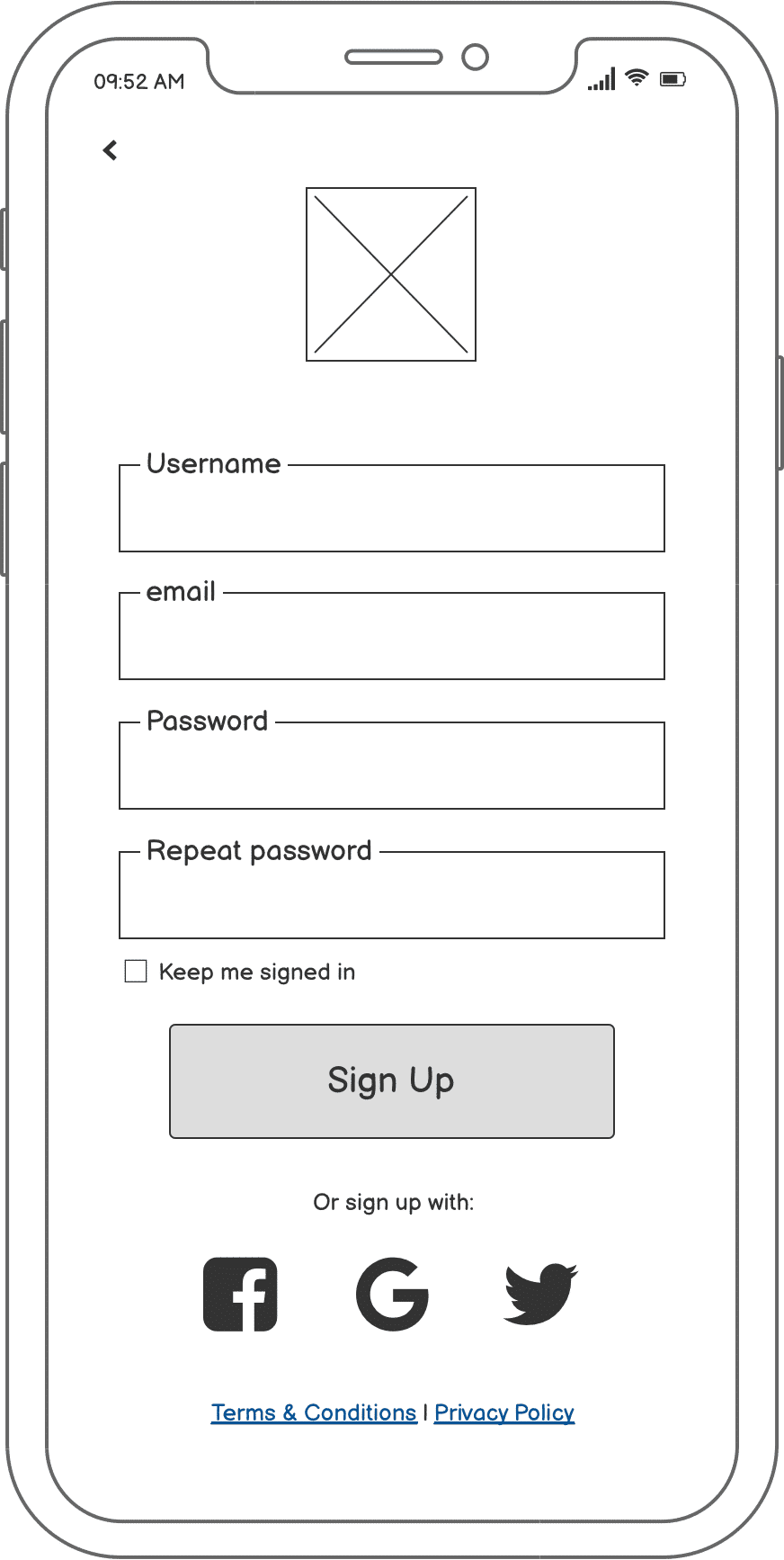
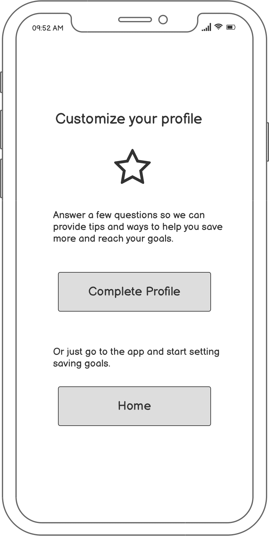
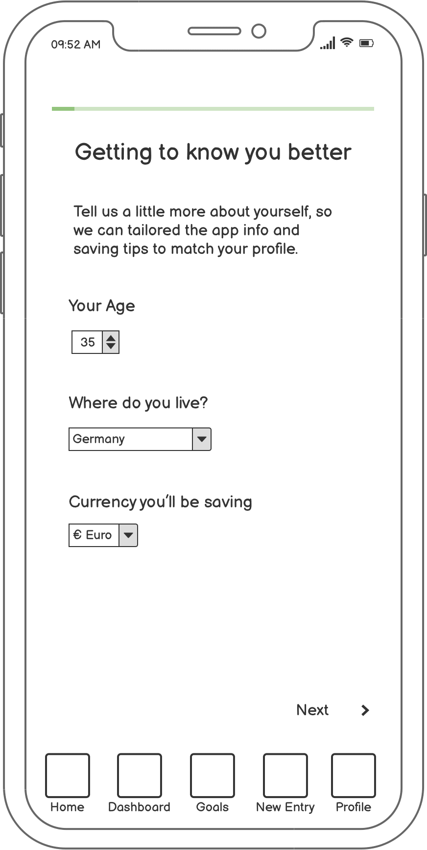
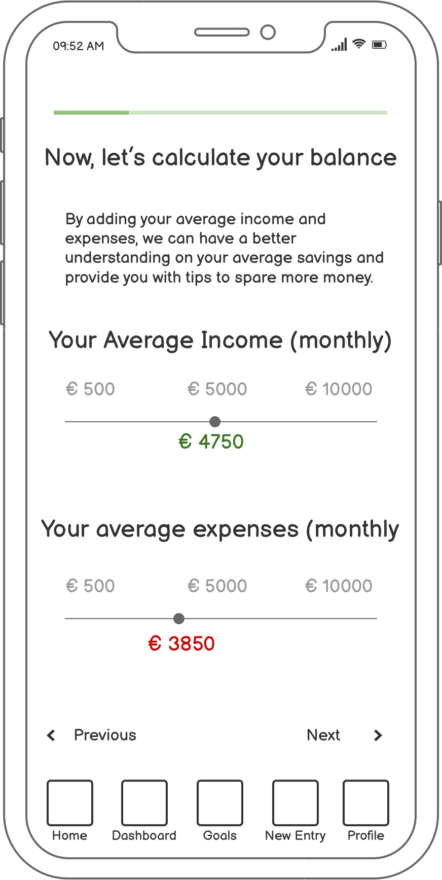
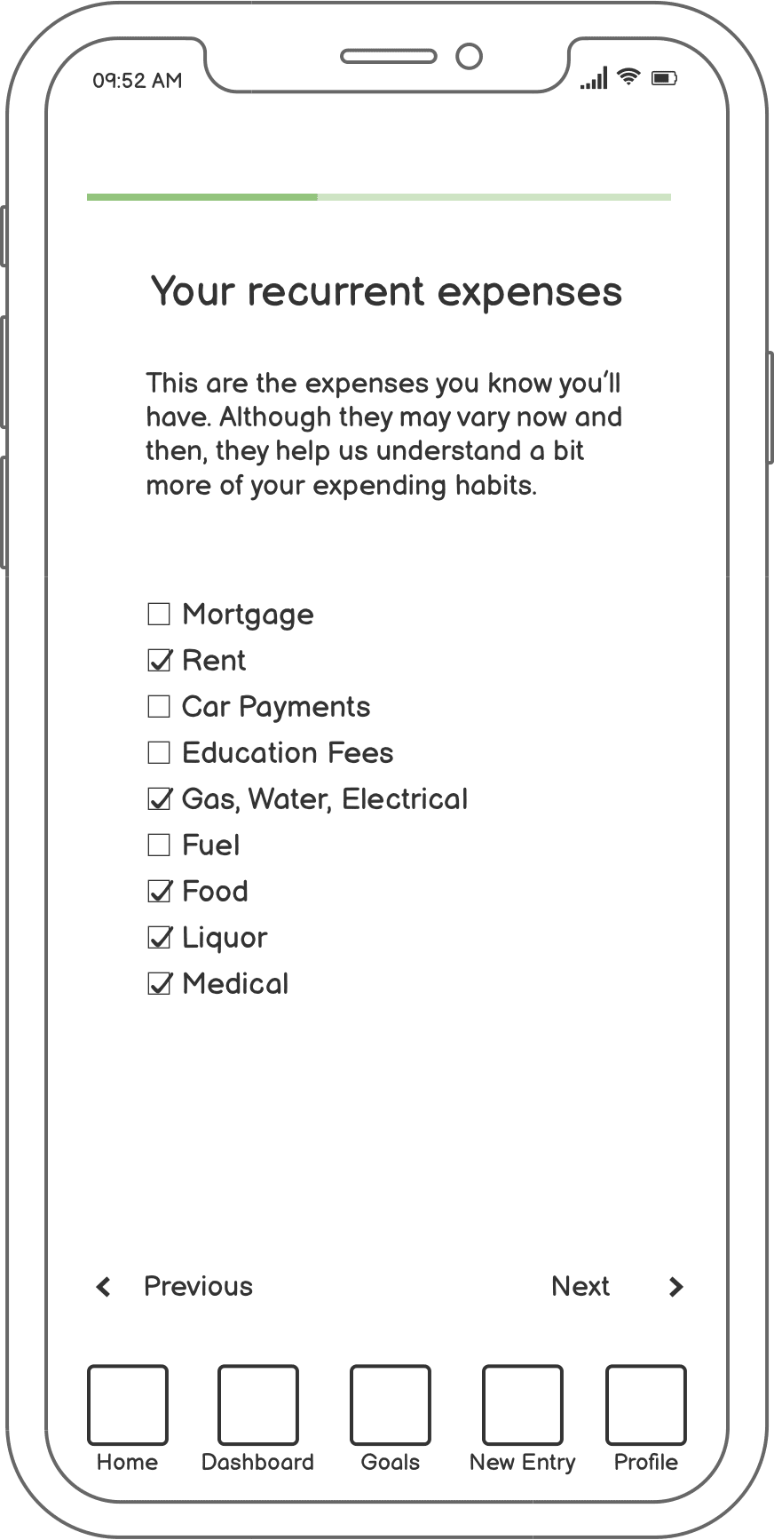
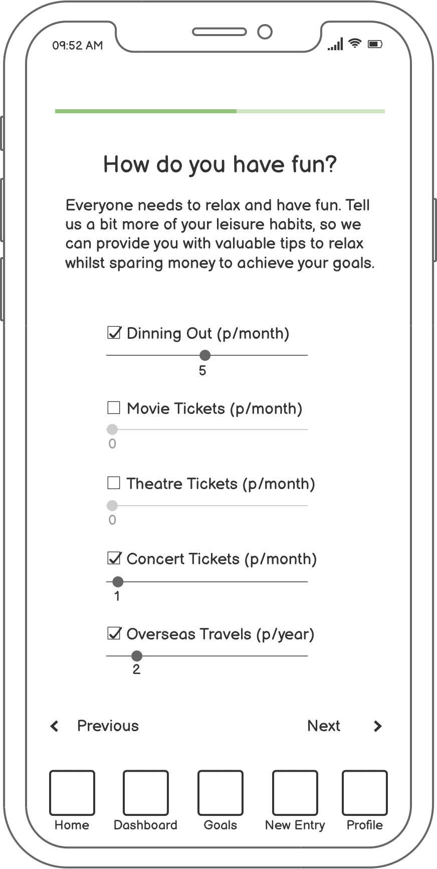
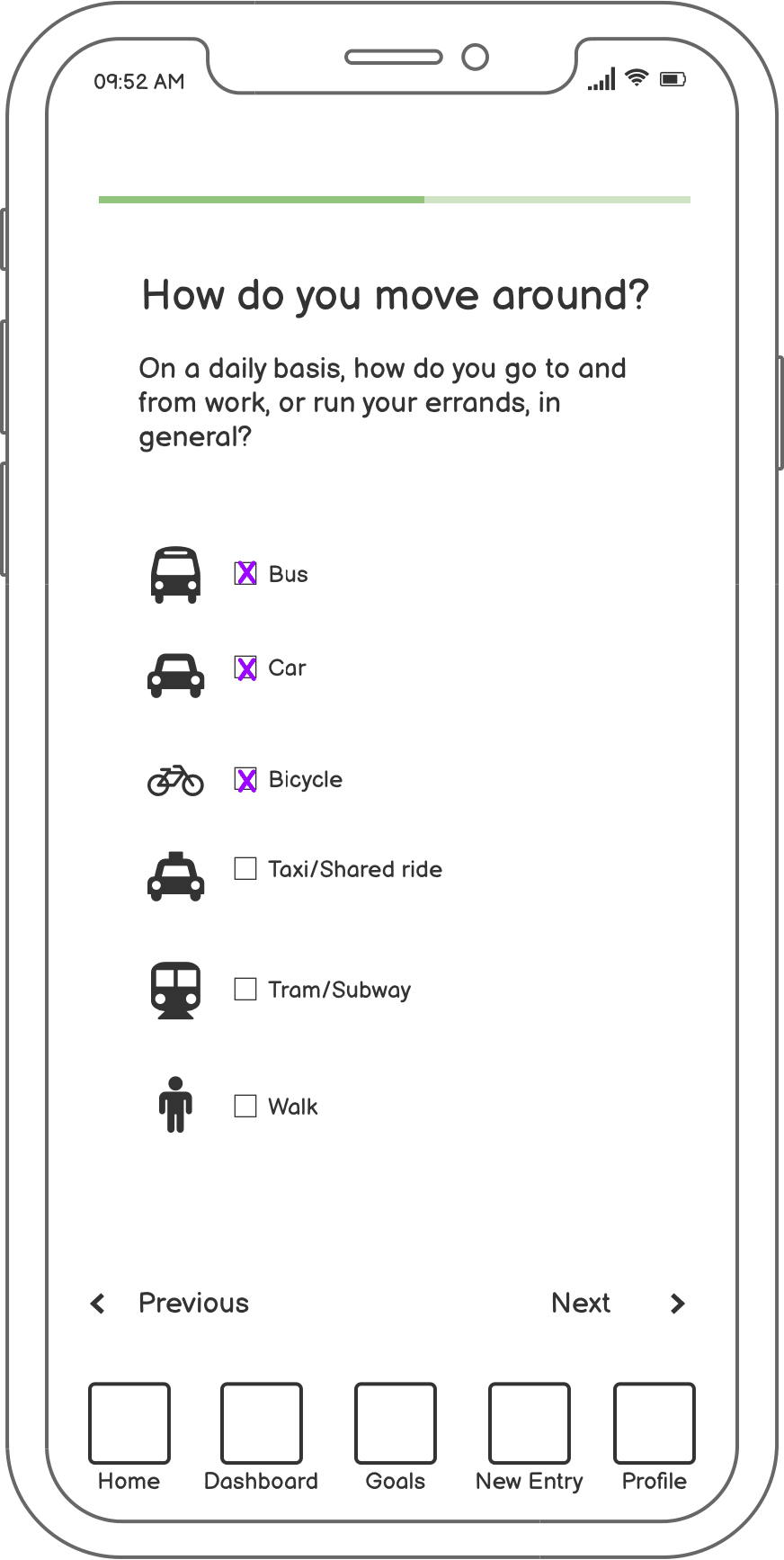
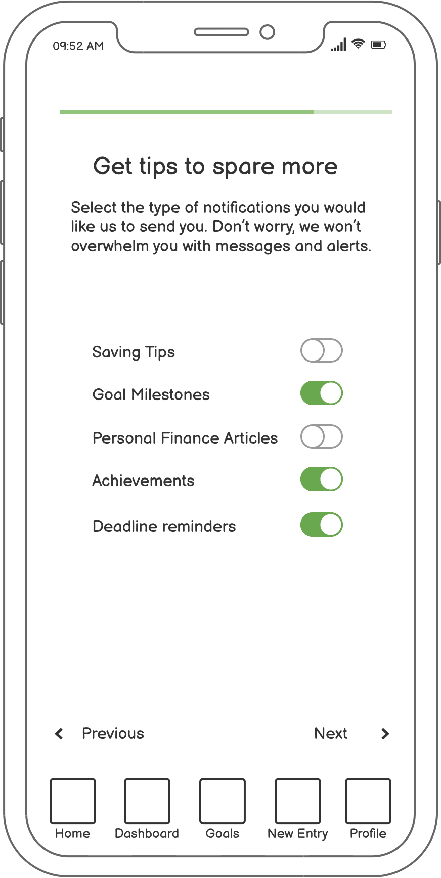
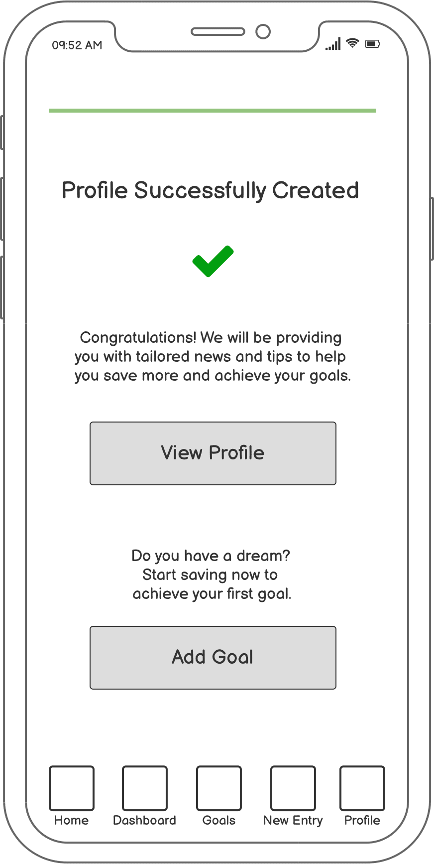
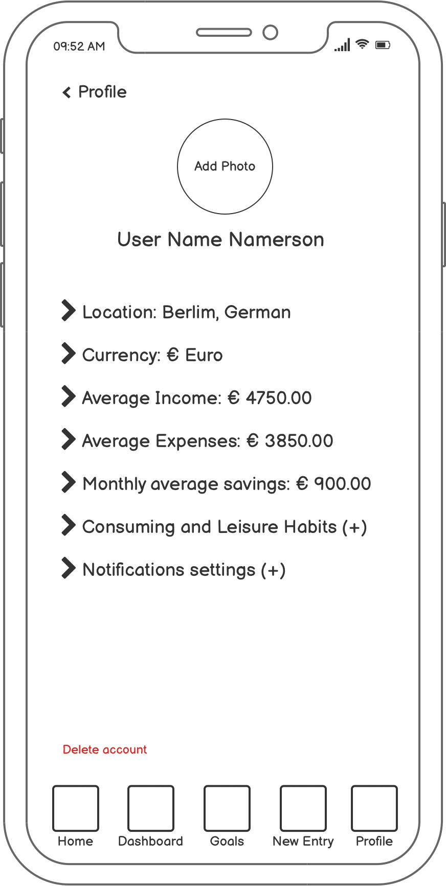
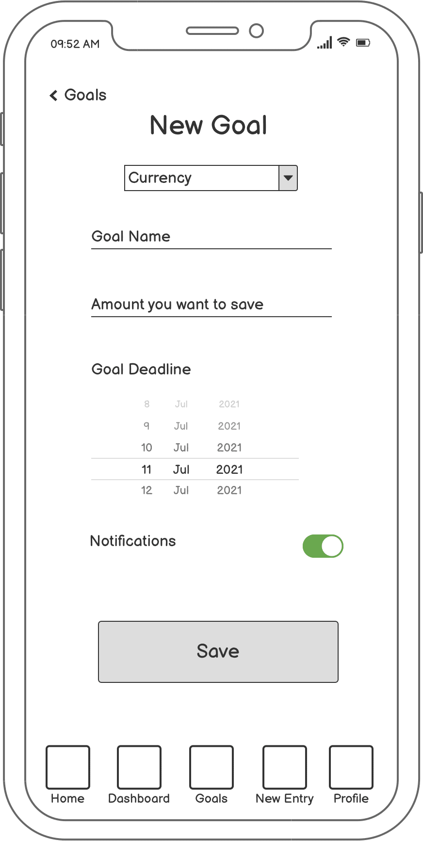
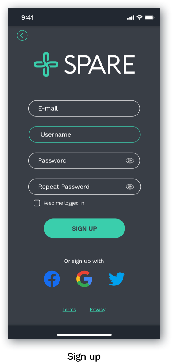
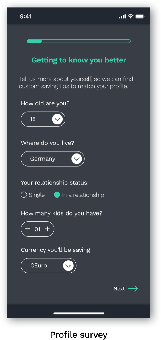
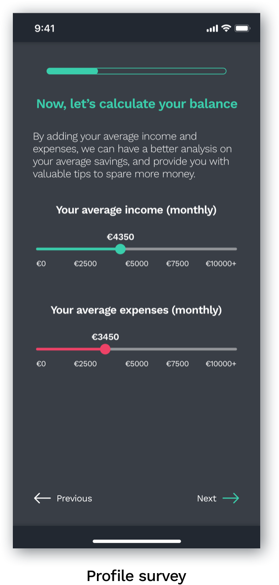
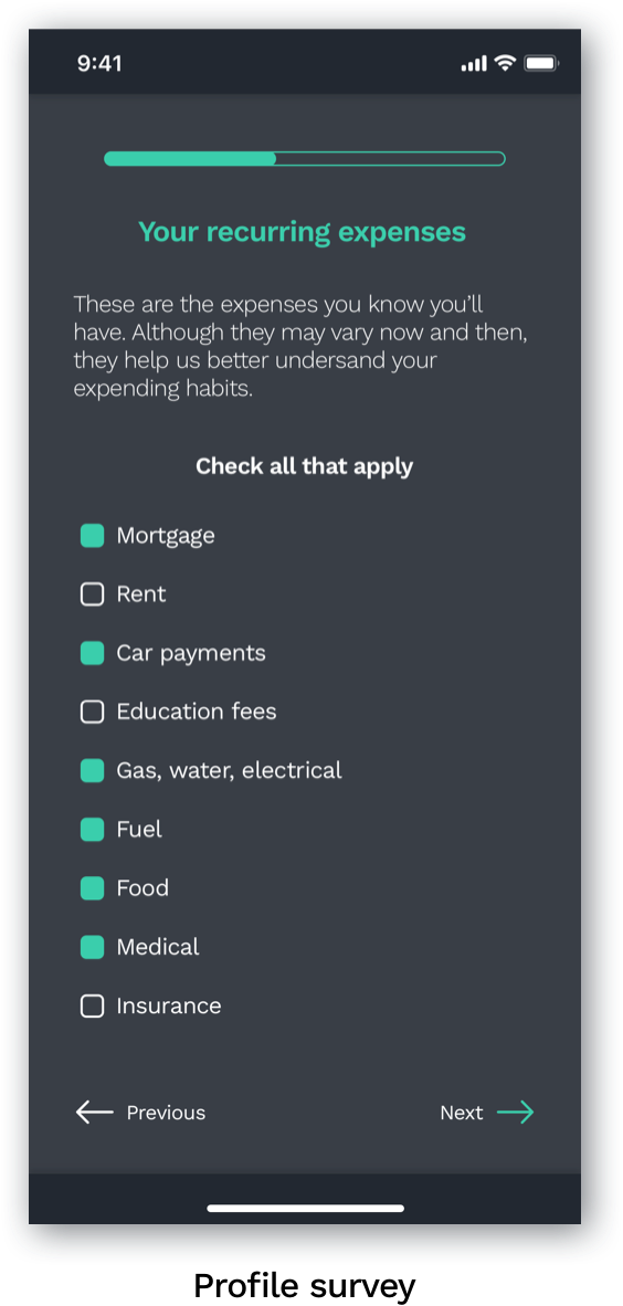
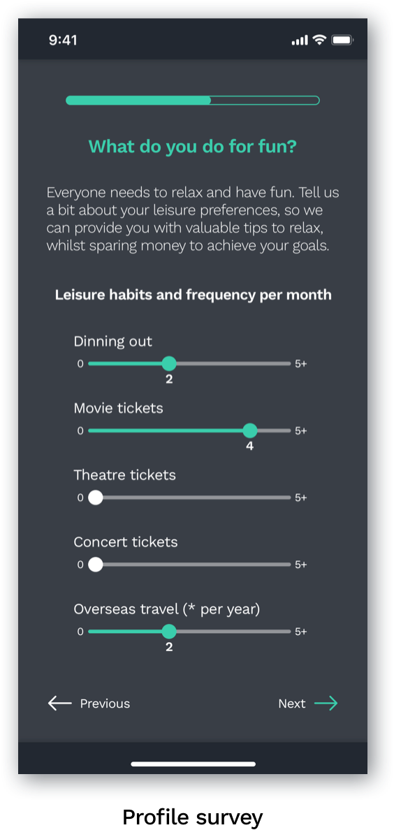
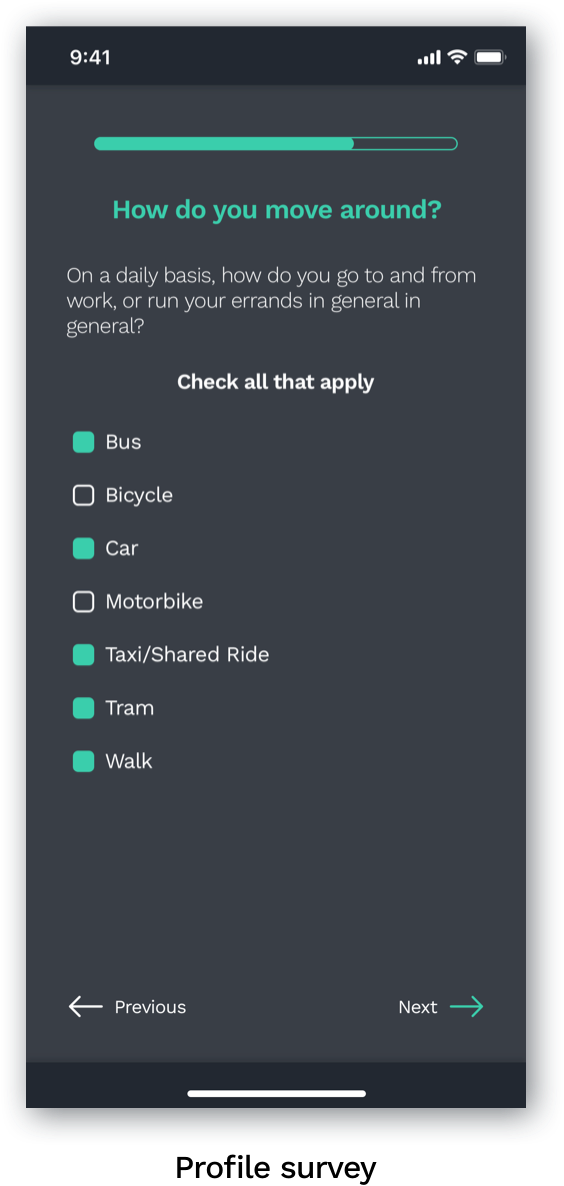
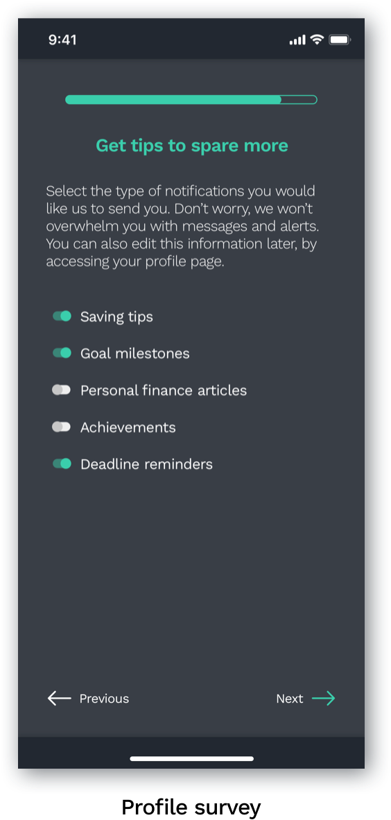
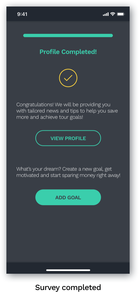
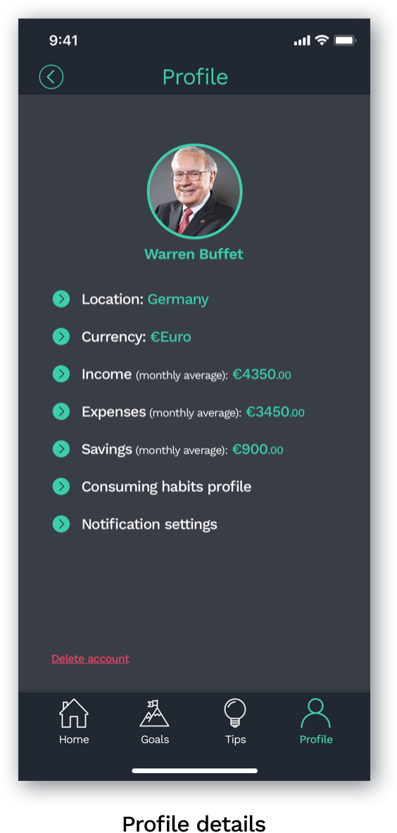
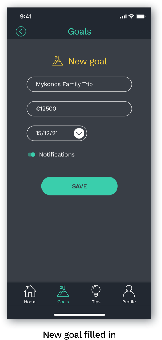
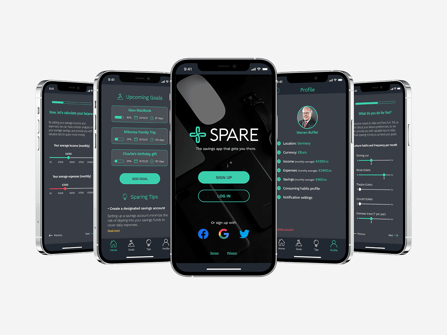
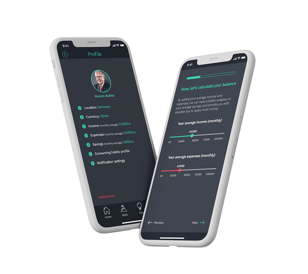
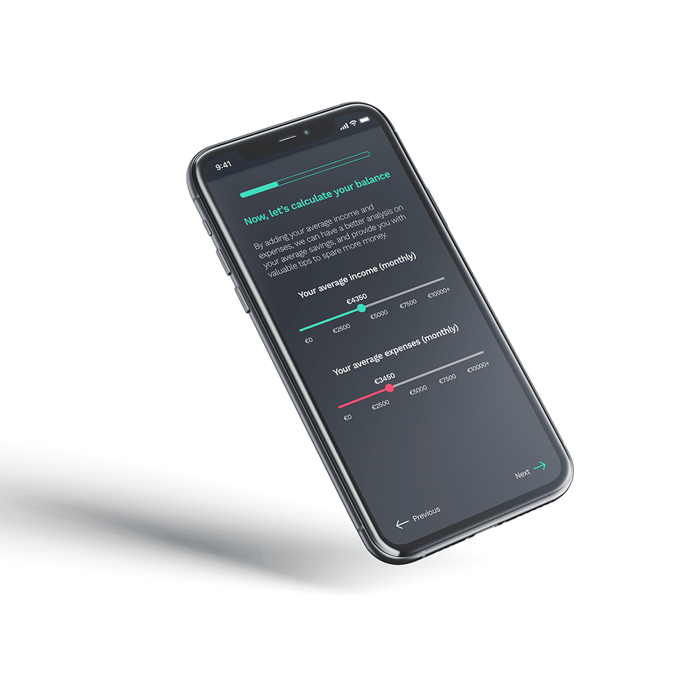
“As a new user, I need to be able to create a profile, so that the financial advice I receive is personalized to me, my spending habits, and tailored to my goals.”

#2

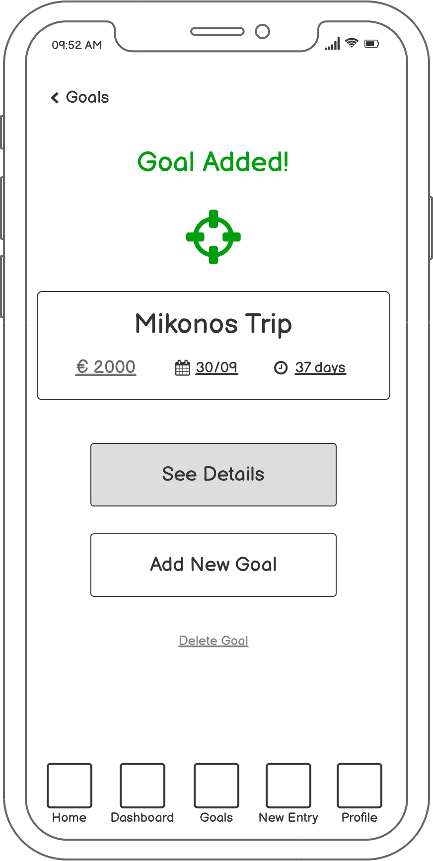
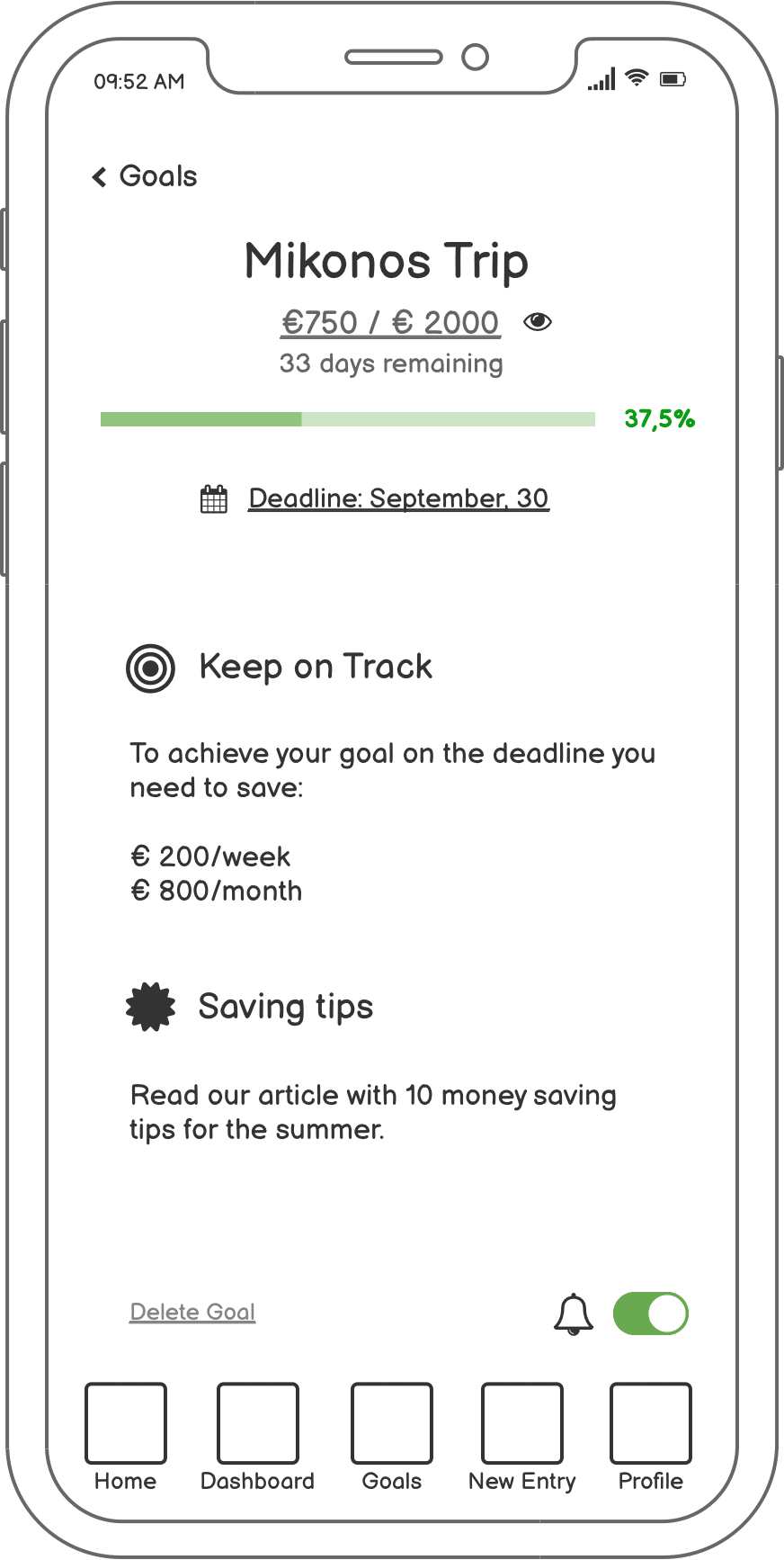
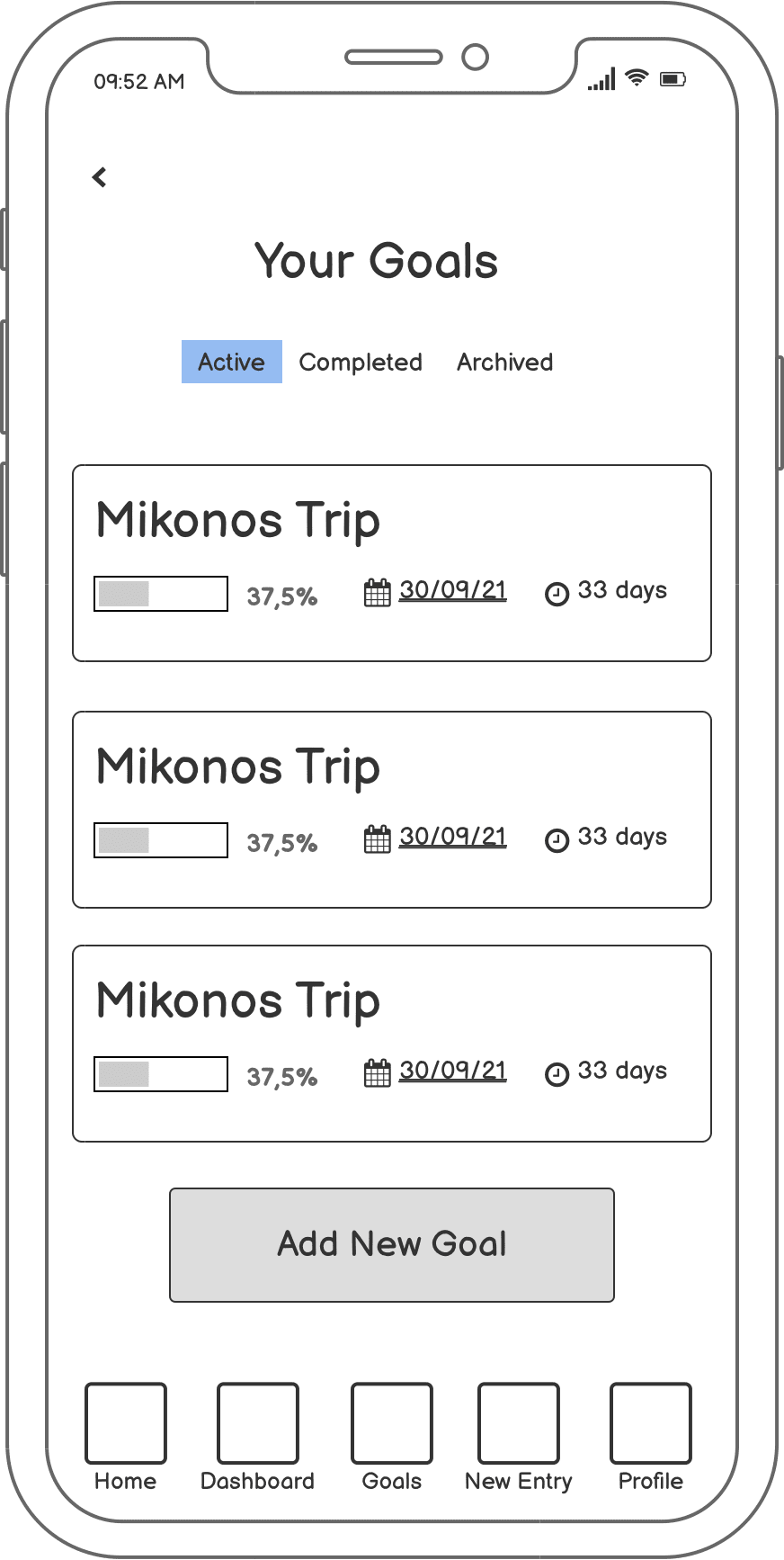
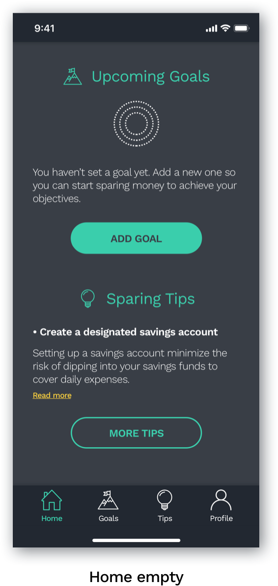
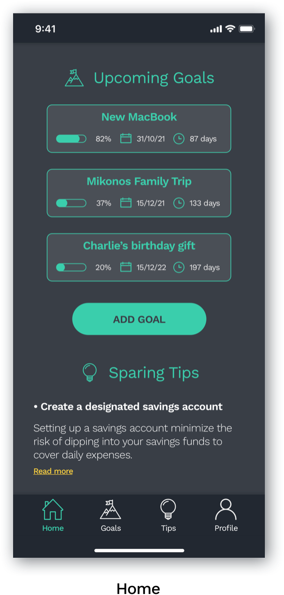
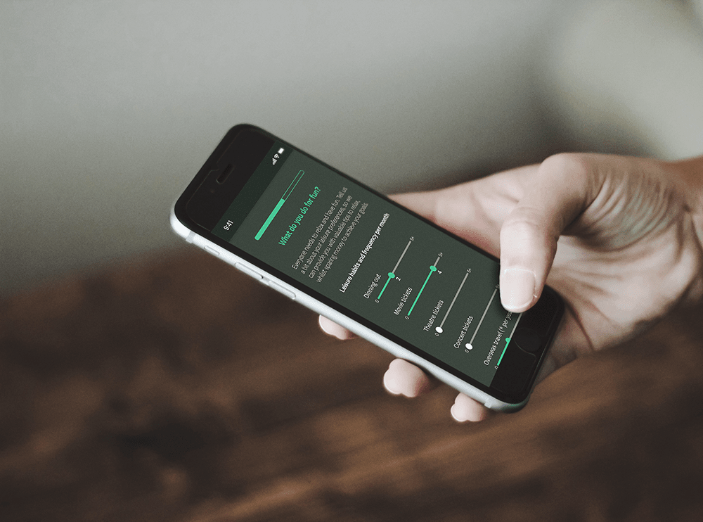
“As a user, I want to see a dashboard of my finances clearly and visually, so that I can see how much I am spending on what at a glance.”

#3

“As a user, I need to be able to tell the tool what my savings goal is and how long I have to reach it, so that I can save accordingly.”

#4

“As a user, I want to be notified and rewarded when I have reached certain milestones throughout the saving period so that I know whether I’m on track to reach my goal.”

Mid-fidelity Wireframes

UI Elements

High-fidelity Wireframes

Tablet and Desktop Product Website

Mockups